The first type of photos everybody takes for the first time in their lives is usually ones with the subject right on the center of the frame. I’m sorry to break it to you but that is everything but how a photograph should be framed. Composition is very important to do well in photography, even more so than understanding the exposure triangle. Anyone can be taught to operate a camera, but having artistic vision is something that is much harder to acquire.
What is Composition?
Composition is a principle of art that is related to how elements are arranged and placed in a work of art. It has to do with how much detail to have in the artwork. Too few could leave viewers with little to interpret with, and too many can be very distracting. Composition can be found also in literature, dance, music, and art forms other than visual art. In a sense, composition is a distinct factor, and one of several, of good artwork.
Composition in Photography
In photography, composition is the arrangement of the elements in an image that works well with portraying it as representing the core intentions of the photographer. It is a way of guiding a viewer towards the subject of the photograph, and oftentimes, in a very specific sequence. Good composition can make a photograph of mundane subjects very powerful as well as ruin photographs with interesting subjects if done poorly.
Arranging elements is simple in portraiture and still photography. However, sometimes, “arranging the elements” means the photographer should move around on his or her feet, zoom in/out, and/or change the height & angle of the camera. When shooting photojournalistically or framing landscapes, it is sometimes not physically possible (e.g. jumping buildings or floating on water) or feasible to move elements around, so the photographer should move him or herself instead.
Sometimes cropping is necessary to save a photograph, but doing so decreases image quality (due to lower resolution). Had an image been taken with tighter framing to begin with, cropping would not be necessary. In photography it is crucial to give composition a lot of thought before hitting the shutter button. Make it your goal to get the composition right every time so you don’t have to spend time cropping.
Composition Rules
1. Rule of Thirds
Instead of focusing at the center of the frame, try focusing off center. The rule of thirds is about focusing at 1/3rd of the frame, either horizontally, vertically, or both. Imagine two equidistant lines horizontally and vertically and you will have guidelines for the rule of thirds. Using the rule of thirds for subjects is a way to give your photos a lot of balance.
Also, there is an alternate version of the Rule of Thirds based on Fibonacci’s Ratio (a.k.a. the Golden Mean, Phi, or Divine Proportion). Advanced photographers argue that the 1:1:1 ratio of the original rule of thirds oftentimes cram subjects off the frame, and that the 1:0.618:1 ratio of the rule based on the Golden Mean gives even more balanced photos.
See for yourself and compare different pictures with subjects framed in the center and ones with subjects near the intersections of the Rule of Thirds. You will probably find that the pictures following the Rules of Thirds appear to have more “pop” and pull you in longer. They just feel more balanced.

The girl is closer to the 2nd vertical line, though this example is not exactly perfect. The idea is that she is off-center
2. Fill the Frame
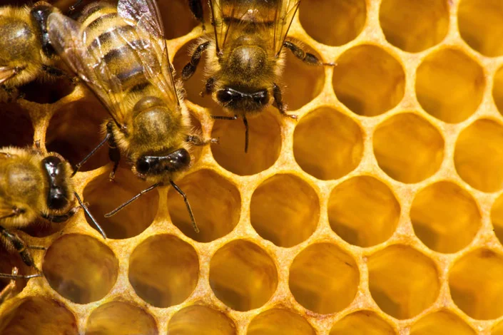
After you know what the subject of the photograph should be, try zooming in/walking towards the subject. Doing so will simplify the photography by enlarging the subject and cutting out unnecessary objects & lines that would otherwise be distracting.

Frame filled by bees and honey hive
3. Balancing Elements
When you’re using the rule of thirds and shooting subjects off-center, you can get a lot of negative space on the other side of the photo. You can balance it with another object to fill in space. Also, think of the center as the fulcrum of a seesaw that has the subject and all the objects in the photograph. Use distance from the center to balance large and small objects and prevent anything from looking like it will “fall” out of the photo because it looks unbalanced.
Oftentimes you can ignore the rule of thirds if you can create balance between the elements in the photograph. But still frame the subject off-center if you can help it.

Here, the left tower of the bridge is closer to the center of the frame to balance out the “smaller” tower that is further out on the right
4. Leading Lines
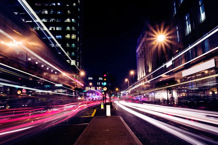
Our eyes tend to follow lines. You can use this tendency to align lines in your composition in a way that causes them to guide the viewers through the scene and towards the subject in an interesting way. What to look for: zigzag, diagonal, radial, and parallel lines.

Lines created by the light all converge towards a single area near the horizon of the photo
5. Perspective
Oftentimes you can get interesting composition by changing the height and angle of your camera for an alluring effect. Try shooting above or on top of the subject or below and closer to the ground.

6. Depth
One way to add another dimension into your two-dimensional photographs is by portraying a sense of depth by using different layers in the scene: the foreground, midground, and background. Another technique to create depth is by obscuring one of the layers, the background for instance, and keeping the subject in the foreground tack sharp.
7. Symmetry & Patterns
Patterns and symmetry in a photography can be very aesthetically pleasing to the eye. They give a sense of balance and order. Also, pattern and symmetry can be intentionally broken to create a point of focus on the subject.
8. Complementary Colors
Learn how to use complementary colors in your photographs. Complementary colors pair well together to create an aesthetic harmony to make certain elements or the subject stand out. The photo above features harmony between blue and orange, which are complementary colors.
9. Foreground/Background Separation
Multiple elements can be separated by having one in focus in the foreground with the rest in the background slightly out of focus. You can also use other composition techniques such as balance or strong colors to create harmony between the foreground and background.
Also, pay attention to the background when composing your photo. Avoid objects directly behind your subject or behind your subject’s head to avoid objects “growing” from them. Pay attention to clutter in the frame, and/or change to a wider aperture to blur the background.

10. Space to Move
Most of the time, give subjects room to move. Even though photography is rather static, subjects can still be portrayed with lots of movement. Balance the photo in a way that gives the subject room to move into, otherwise the photo would look crowded and the subject would look like it’s about to crash into the edge of the photo. In the same way, give room in front of people in portraits so viewers can follow their gaze.
One of the biggest mistakes of beginners learning the Rule of Thirds is framing subjects in a way that makes them look like they are walking out of the picture or falling off a cliff. As in, frame the subject looking towards the center or moving into the picture, rather than facing out towards the edge. Otherwise it will just look like they are moving off a cliff.

11. Keep Verticals Vertical & Horizontals Horizontal
There is nothing worse than images that are not leveled properly. Tilted images just don’t look right when not intentional. If this blunder is commited, post-processing and cropping will be required, and you know how I feel about cropping.

See the problem? The horizon is tilted. The image now needs to be rotated and cropped.
Photo by: Matt Morton-Allen, CC
12. Tangent lines & Merging shapes
When composing, careful check all background lines near the subject. Avoid parallel and lines tangent to each other, which creates a very cluttered look and emanates a feeling of being crushed. Also watch out for merging shapes. Separate objects should stay separate.

Squished and crammed. Source

Problem solved. Source
13. Head Growths & Crowns
One of the biggest blunders when shooting portraits is to have trees and objects partially behind the person. In 2D, it will look like they have monsterous, creepy mutations, or bizarre crowns. Try to move people away from objects behind them, or if there are objects, make sure that the texture and color is uniform to avoid them looking like growths and appear more like backdrops.

See his overgrowth “crown”? Unpleasant composition.
Photo by: Michael Miller, CC
14. Diagonals
In the sense that horizontal and vertical lines create a sense of stasis and stability, strong diagonal lines can create drama and movement in a photograph. This can be done by using a Dutch Tilt, turning the camera while taking the shot, or using a wide angle lens and shoot from above or below. The perspective of a wide angle lens introduces distortion in a way that can create stronger diagonals the closer the subject is.

15. Vertical Shots
If you get bored of shooting the same horizontal alignment, try turning your camera vertically for a different composition. Experiment by getting both horizontal and vertical shots at the same time.
Experiment/Break the Rules
While rules are great to follow to create photographs with strong composition, sometimes intentionally breaking the rules can create aesthetically pleasing images. The reason to understand composition is to be able to see how a photograph can affect the minds of those who view those photographs. Photography is more like art or language rather than a mathematical formula. It is all about engaging with your Right Brain, experimenting and feeling, then creating forms of art to portray those emotions. In this sense, there really is no right or wrong way to take a photograph. Do not be afraid to experiment, but make sure that if rules are broken, then make sure that it is intentional rather than accidental.
Written by: Brandon Yuong
